Brief
Bioenergy started as an artisanal vegan food lab, built on seitan, tofu and tempeh, and had grown on local and regional success alone. The real challenge wasn't just designing a logo and packaging system — it was turning Bioenergy from just another vegan brand into one that could carve out real shelf space, stand out among competitors, and communicate "vegan" in a way that felt appetising rather than dutiful.
Strategy
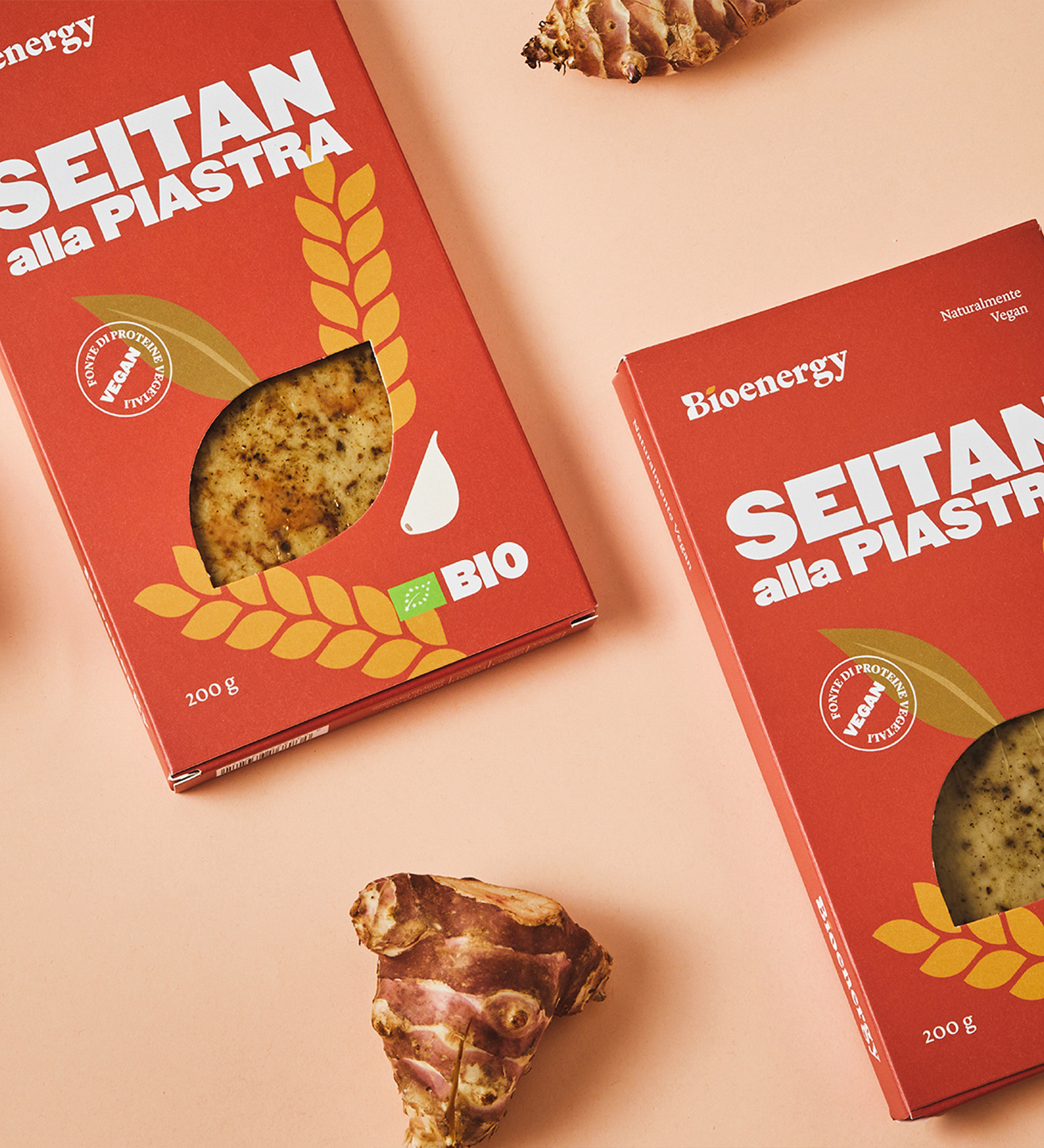
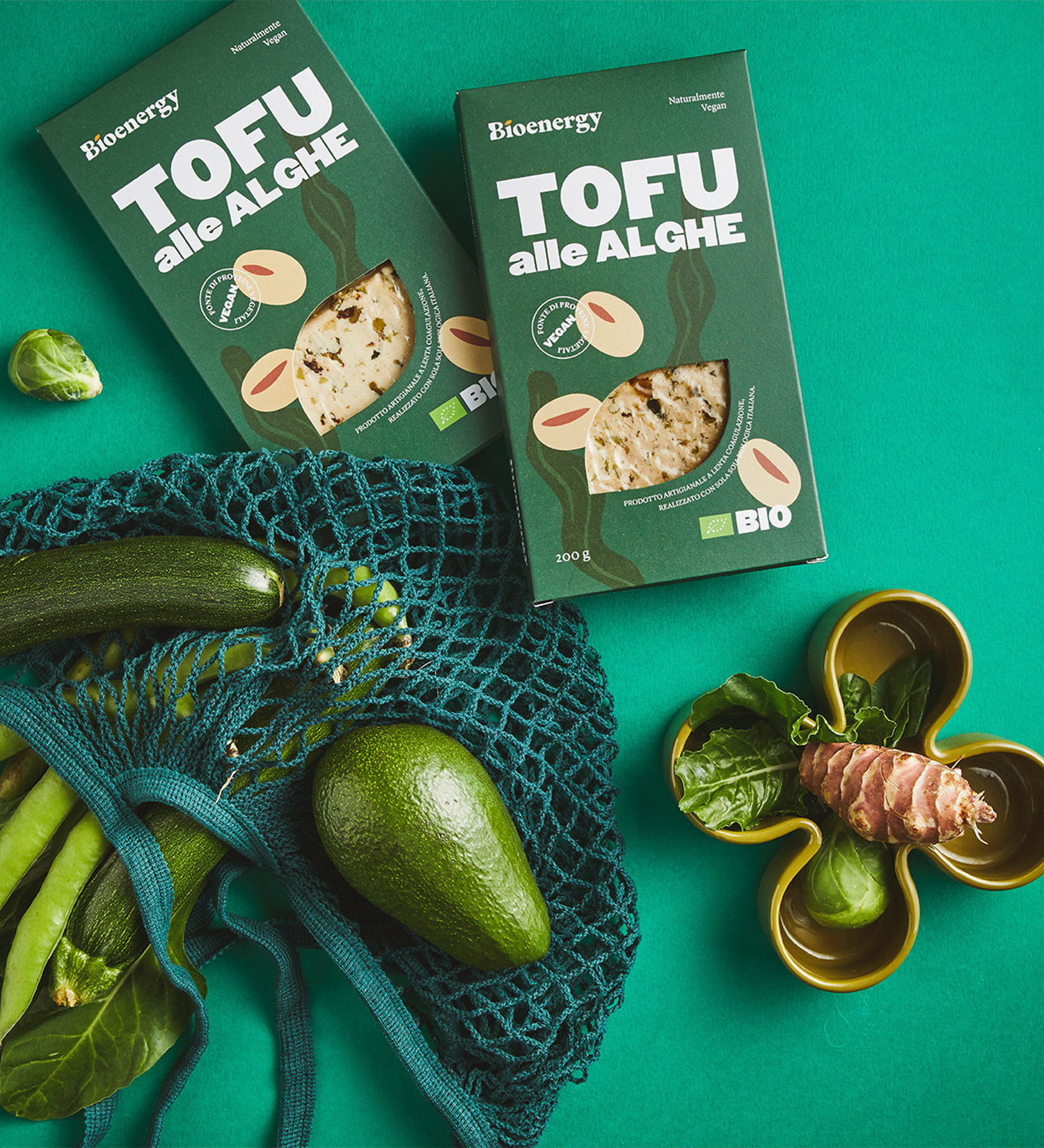
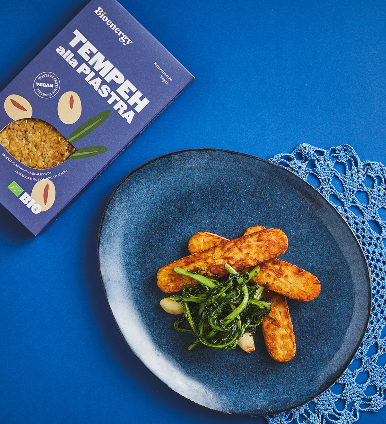
Most vegan packaging plays it safe, betting on restraint to signal quality. Bioenergy bet on the opposite: personality. Each product line was treated less like a variant and more like its own small character — different colour, different illustration, same DNA — so the range could compete in the market as something cool, not just another boring "healthy" product.
The answer
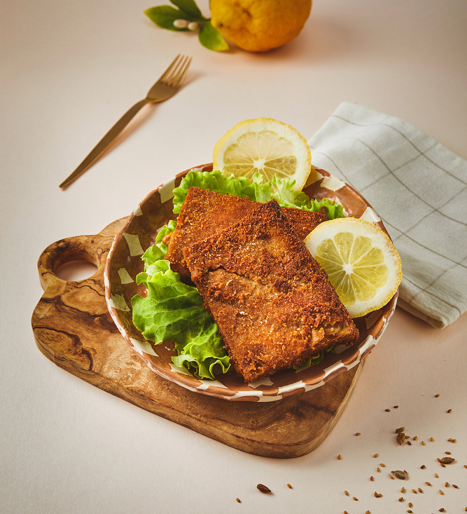
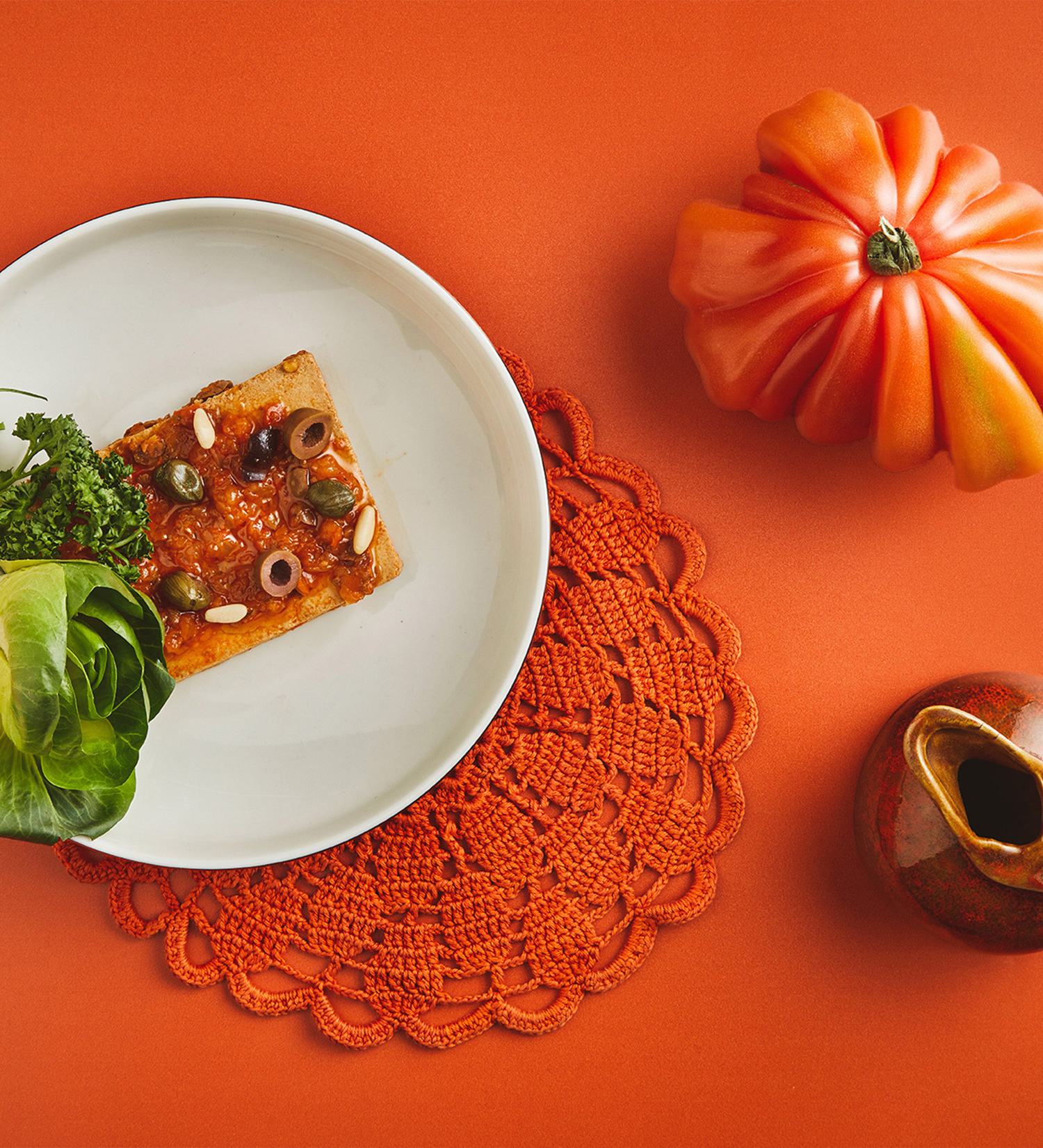
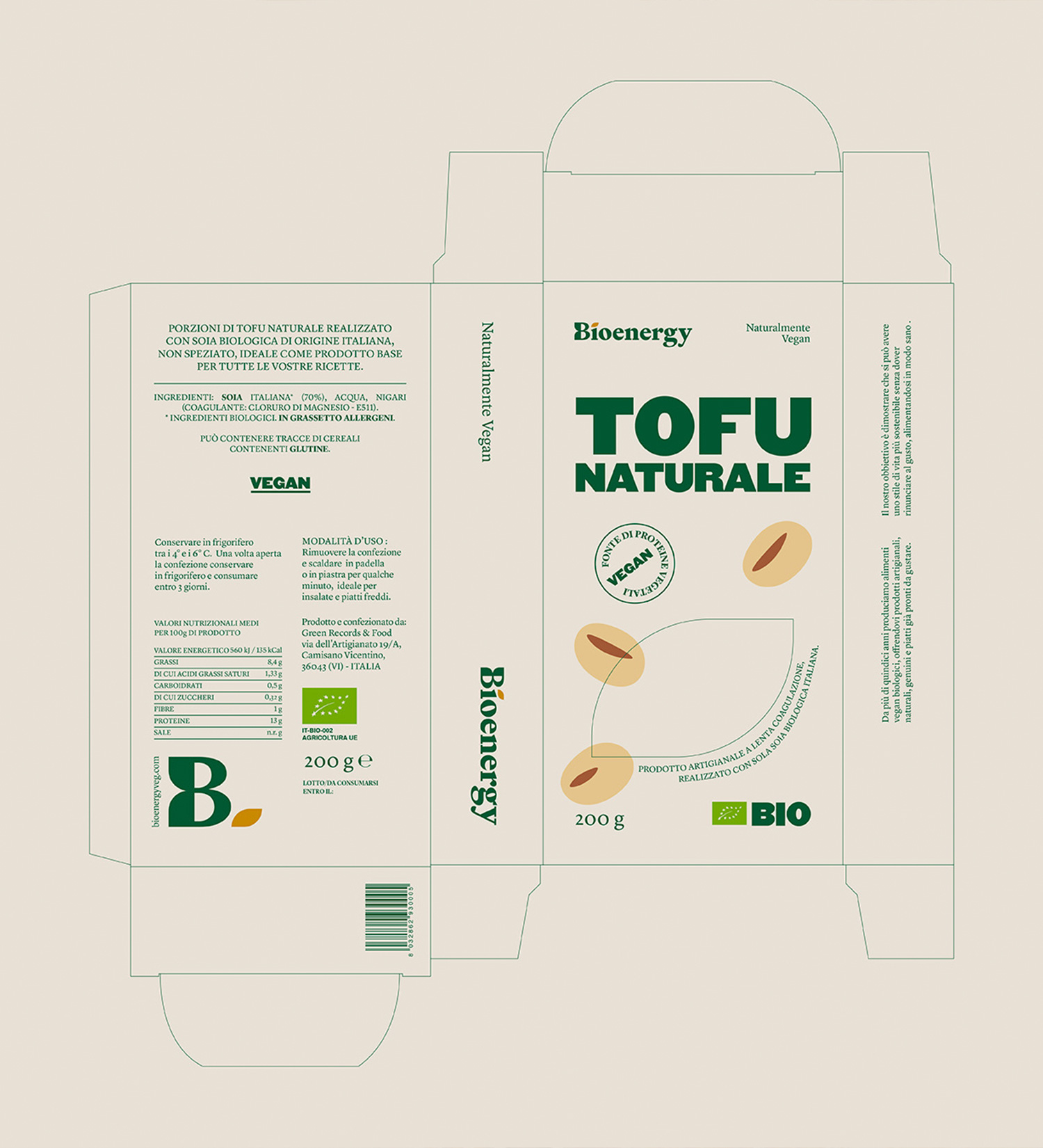
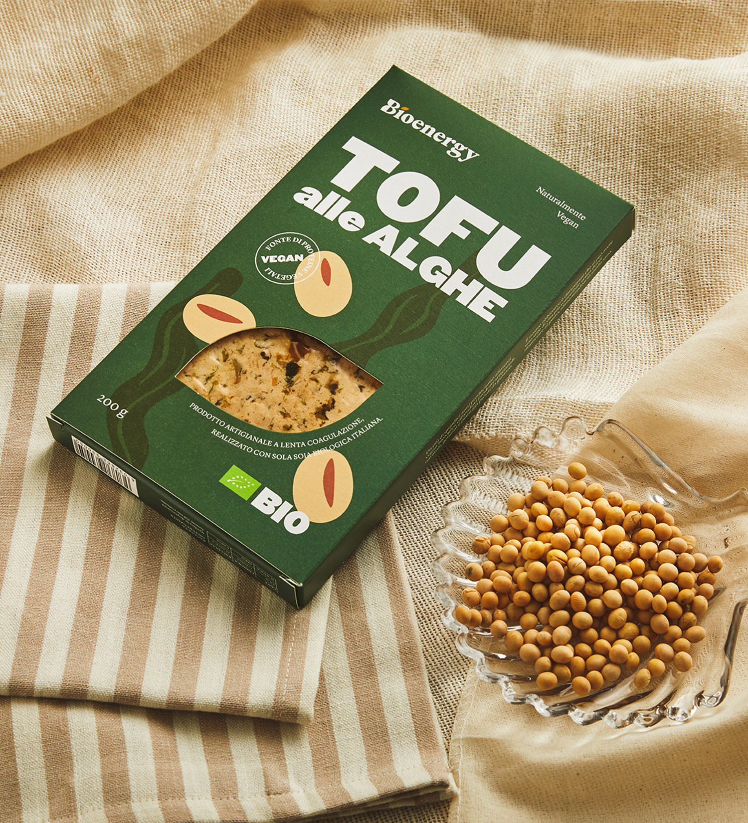
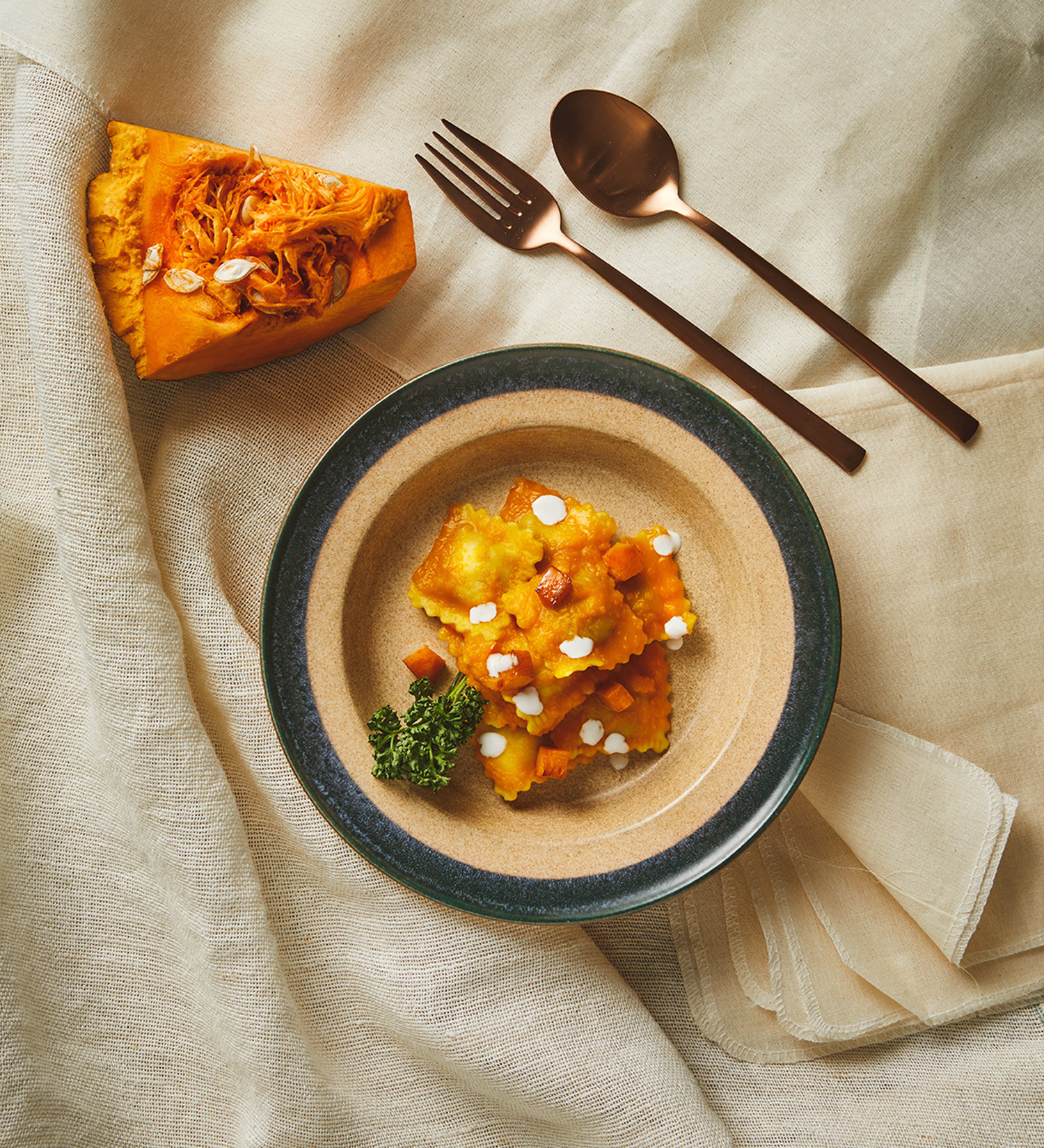
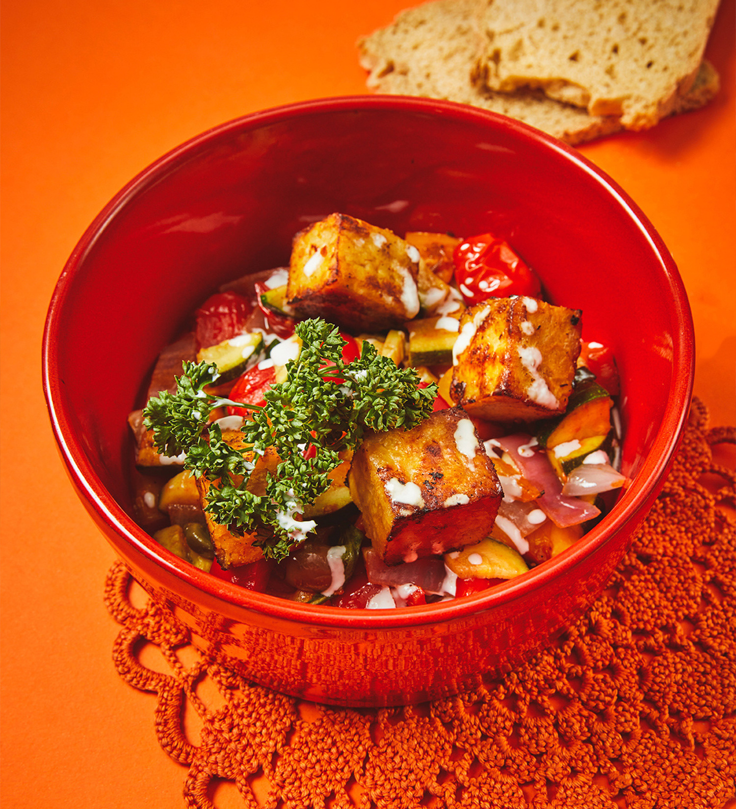
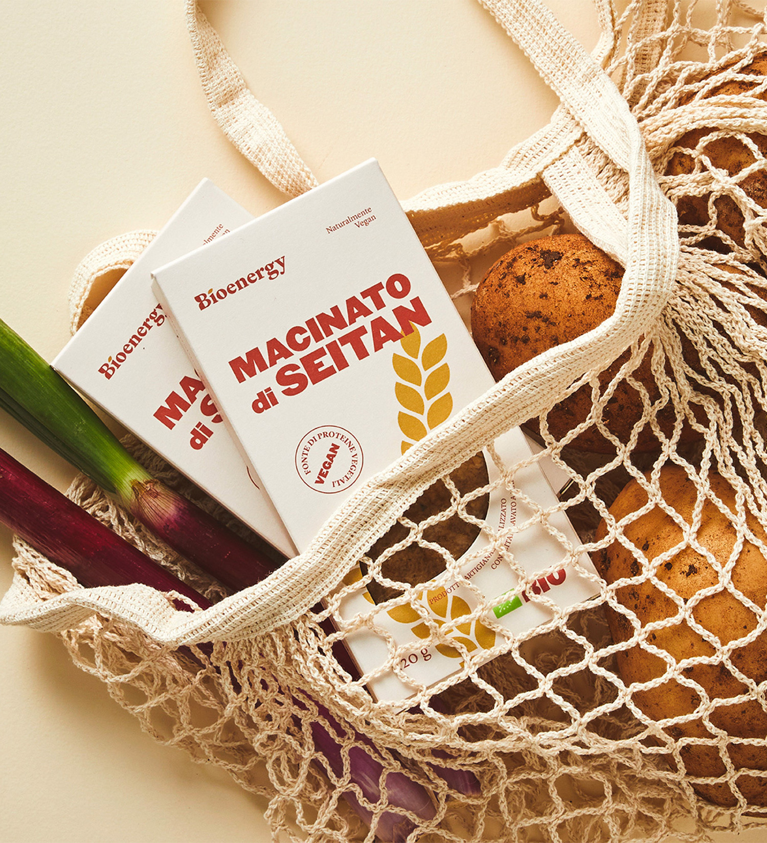
Each product line gets its own colour, bold enough to read shelf-fast without tipping into boring. Chunky typography puts the product name front and centre, paired with hand-drawn illustrations tied to the ingredients. The leaf-shaped product window echoes the logo, letting the product peek through as proof, not promise. Photography stays rustic but vivid in colour, keeping the whole system fresh and appetising.